


Barcodes in South Africa are hugely important in our consumer world for the automated identification and capture of data and information. But these important little things are hardly ever the highpoint of the design of product packaging and are often completely ignored. You might think – how about we add some colour to brighten it up? Which at first glance might be a good idea, but be warned! While a cute colour combination might look nice, some can have a very negative impact on the legibility of the barcode and might even render them completely unscannable.
These errors could not only have a hugely negative impact on retail productivity, they can also lead to your company suffering huge costs. So, what are the rules on barcodes and colours? Do you have to be restricted to printing your barcode in black and white or are colour combinations possible? And if so, which ones? Here are some tips.
Limitations of scanners:
Barcode scanners work by using a light source that shines red. They need the bars and their background to have enough of a contrast between the light and dark colour so that the sensors will be able to pick up and assess the reflected light. The difference in the reflection of the light and dark colours is referred to as the Print Contrast Signal. In order to ensure that the scan-ability of the barcode is not impacted, you need to make sure that this is always at least at 80%. It is for this reason that the background colour is always at the lighter end of the colour spectrum while the bars are kept at the darker end.
Now let’s take a look at what the best and worst colour combinations are:
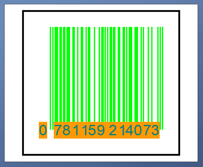
Good colour combinations:

The background, also known as the “quiet zone” needs to be light enough so that the scanner can differentiate the background as being spaces between bars. Because the scanner is red, background colours need to be in the red spectrum so that the scanner cannot “see” them. This includes shades of yellow and orange. What can also be used as a background is the colour red as white since the barcode scanner is red and will thus never be able to pick it up.
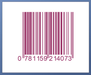
Bad colour combinations:

With this in mind, it would seem that while a technicolour barcode might be an attractive idea, in reality, it is more trouble than anything else. Remember that the ordinary 1D Universal Product Code (or the UPC) is not the only barcode available! There are now a variety of 2D barcodes, some of which are even free for public use, and require only a 20% contrast in order to remain scannable. So not only would you have access to a whole new world of colour options, you also have access to a range of design options and can play around and let your creative juices flow! Keep this in mind next time you need to create a barcode!
If you are looking to buy barcodes in South Africa – here is a great site I found – https://www.barcodesolutions.co.za/.


